Friday, February 27, 2009

CSS 2 Column Layout


This is based on the CSS 3 Column layout I published earlier tonight so please refer to that posting for any special instructions. The only difference is the center col stretches across the rest of the page. Obviously by simply changing the widths you could have the small column on the right hand side of the page.

The css is identical to the other example save the 3rd column and the width of column 2, here is the code again:

(1 thing I didnt include in the other example was the css for the shade and the header - The shade is just a div of a 1x7 pixel image set to the background to create a shade effect. An example of this can be seen on the page Background Shade Effect on pages )

.header {
width:100%;
background-color:#ffffff;
height:50px;
text-align:center;
}
.banner {
padding:5px;
}
.shade {
background-image: url(../images/shade_gray.jpg);
line-height:7px;
}
#container {
width:100%;
padding:0px;
text-align:center;
}
#left {
width:20%;
padding-left:5px;
margin:10px 0 0 10px;
float:left;
text-align:center;
background-color:#ffffff;
height:450px;
}
/* Content Area */
#main {
float:left;
overflow: auto;
width: 75%;
background-color:#DEE2EA;
margin: 10px 15px 15px 15px;
font-family: Tahoma, Verdana, Geneva, sans-serif;
font-size: 12px;
text-align:center;
background-color:#ffffff;
height:450px;
}

and the html:
<div class="header">
Header/Banner goes here
</div>
<div class="shade"> </div>

<div id="container">
<div id="left">
Col 1
</div>

<div id="main">
Col 2
</div>

CSS 3 Column Layout


Using div only, here is a simple way to get a 3 column layout with a div on top for the header or banner. Please note here I have just given certain styles (white background, black border, 450px height etc) to highlight the columns. To make this page look good, you could build it out with css portlets like Portlets in CSS (1) or Portlets in CSS (2)

The basic idea (after the header div) is to create a container div, and then add the 3 columns at your desired width, all set to float:left;. Here is the css:

#container {
width:100%;
padding:0px;
text-align:center;
}
#left {
width:20%;
padding-left:5px;
margin:10px 0 0 10px;
float:left;
text-align:center;
background-color:#ffffff;
height:450px;
border:1px solid #000000;
}
#center {
float:left;
overflow: auto;
width: 55%;
margin: 10px 15px 15px 15px;
text-align:center;
background-color:#ffffff;
height:450px;
border:1px solid #000000;
}
#right {
width:20%;
padding:0px;
float:left;
margin-top:10px;
text-align:center;
background-color:#ffffff;
height:450px;
border:1px solid #000000;
}

Here is the html:

<div class="commercialHeader">
Header/Banner goes here
</div>
<div class="shade"> </div>
<div id="container">
<div id="left">
Col 1
</div>
<div id="center">
Col 2
</div>
<div id="right">
Col 3
</div>
</div>

Thursday, February 26, 2009

Background Shade Effect on Pages


Many of the sites you see nowadays that are center aligned, have a nice little shade effect between the over all background color and the background color for the content. You can see what I mean in the screen shot. This effect is very simple to accomplish.
In photoshop, create an image 1 pixel in height and variable width depending on how wide you want the content section. In this example my overall width is 936 pixels - 36 pixels either using a gradient between 2 shades of dark green. Once you set this as a background in a div, set to repeat-y and it will repeat as your page grows. I have included the bg image at the bottom of this post.(update - getting repeated errors trying to upload, so ping me if you need a copy)

Here is the css

#topbar {
line-height:15px;
background:#416845;
width:100%;
}

#background {
width: 936px;
margin: auto;
background-image: url(../images/background2.jpg);
background-repeat: repeat-y;
}

#container {
width: 864px;
margin: auto;
background-color: #eae5c5;
}

Here is the html
<div id="topbar"><br /><br /></div>
<div id="background">
<div id="container">
<!-- Content -->
</div>
</div>

Wednesday, February 25, 2009

Vertical CSS Menu with Multiple Submenus


When using customized lists to build menus it allows you to easily create submenus. The css is this example is quite long winded as it goes 5 deep. There are a couple of smaller vertical menus on this blog if you prefer an example with 1 or no submenu.

The styles I used to differentiate the 5 menus were
1 - Different Background Color, Bold Text
2 - Bold Text
3 - Regular Text
4 - Regular Text, Indent
5 - Smaller Text, Further Indent

Heres the CSS - whitespace removed
/* Begin Vertical Menu with 4 submenus*/

#vertmenu {height:400px;background-color:#e9ebef;width: 165px;padding: 0px;}

#vertmenu ul {list-style: none;margin: 0px;padding: 0px;border: none;}

#vertmenu ul li {margin: 0px;padding: 0px;}

#vertmenu ul li a {display: block;padding: 5px 0px 2px 5px;text-decoration: none;color: #3c444f;width:160px;font-weight:bold;background-color:#e9ebef;}

#vertmenu ul li a:hover, #vertmenu ul li a:focus {color: #ffffff;background-color: #98abc8;}

/* SubMenu 1 */
#vertmenu li li a:link, #vertmenu li li a:visited {font-weight: normal;background-color:#ffffff;padding: 2px 0 3px 5px;color: #3c444f;font-weight:bold;width:160px;}

#vertmenu li li a:hover {padding: 2px 0 3px 5px;color: #ffffff;background-color: #98abc8;width:160px;font-weight:bold;}

/* Submenu 2 */
#vertmenu li li li a:link, #vertmenu li li li a:visited {font-weight: normal;background-color:#ffffff;padding: 2px 0 3px 5px;color: #3c444f;width:160px;}

#vertmenu li li li a:hover {padding: 2px 0 3px 5px;color: #ffffff;background-color: #98abc8;width:160px;}

/* Submenu 3 */
#vertmenu li li li li a:link, #vertmenu li li li li a:visited {font-weight: normal;background-color:#ffffff;padding: 2px 0 3px 20px;color: #3c444f;width:145px;}

#vertmenu li li li li a:hover {padding: 2px 0 3px 20px;color: #ffffff;background-color: #98abc8;width:145px;}

/* Submenu 4 */
#vertmenu li li li li li a:link, #vertmenu li li li li li a:visited {font-weight: normal;background-color:#ffffff;padding: 2px 0 3px 40px;font-size:11px;color: #3c444f;width:125px;}

#vertmenu li li li li li a:hover {padding: 2px 0 3px 40px;color: #ffffff;font-size:11px;background-color: #98abc8;width:125px;}

/* End Vertical Menu with 4 Submenus */

Here is the html

<div style="background-color:#cccccc;padding:3px;width:165px;">
<div id="vertmenu">
<ul>
<li><a href="">Menu 1 (bold+bg)</a>
<ul>
<li><a href="">Menu 2 (bold)</a>
<ul>
<li><a href="">Menu 3 (reg)</a>
<ul>
<li><a href="">Menu 4 (indent)</a>
<ul>
<li><a href="">Menu 5 (indent, sm)</a></li>
<li><a href="">Menu 5</a></li>
<li><a href="">Menu 5</a>
<li><a href="">Menu 5</a></li>
</ul>
</li>
<li><a href="">Menu 4 »</a></li>
</ul>
</li>
<li><a href="">Menu 3</a></li>
</ul>
</li>
<li><a href="">Menu 2 »</a></li>
</ul>
</li>
<li><a href="">Menu 1</a></li>
</ul>
</div>
</div>

Simple CSS Vertical Menu with Submenu


Using the exact same code and background image from Simple CSS Vertical menu with images, I have added a small indented submenu. I will not repost the whole code, just that of the submenu. Click link above to see how the original vertical menu was created.

Things to note here are adding a background color again to override the background image from the main menu, and the padding to shift the submenu 20px to the right.

For an image free vertical menu with multiple submenus check out Vertical CSS Menu with multiple submenus.

/* subMenu */
#vertmenu li li a:link, #vertmenu li li a:visited {
font-weight: normal;
background:#e9ebef;
padding: 2px 0 3px 25px;

color: #3c444f;
width:135px;
}

#vertmenu li li a:hover {
padding: 2px 0 3px 25px;
color: #ffffff;
background-color: #48505b;
width:135px;
}

Here is the html, what has changed here, is that you need to embed the submenu, as a new list in the <li> element of the first list

<div style="clear:both;width:160px;background:#e9ebef;height:200px;">
<div id="vertmenu">
<ul>
<li><a href="">Home</a> </li>
<li><a href="">About</a></li>
<li>
<a href="">Events</a>
<ul id="submenu">
<li><a href="#">» Event 1</a></li>
<li><a href="#">» Event 2</a></li>
<li><a href="#">» Event 3</a></li>
</ul>
</li>
<li><a href="">Gallery</a></li>
<li><a href="">Contact</a></li>
<li><a href="">Site Map</a></li>
</ul>
</div>
</div>

Simple CSS Vertical Menu with Images


Firstly to clarify the image is only for a background hover over/hover out effect, not for the text of the menu item, therefore only 2 images are required. I have attached them to this posting.

The menu is vertical and quite basic, I will use the same style for Vertical Css Menu with Multiple Submenus. I'll also add a submenu to this one - Simple Css Menu with Submenu.

First the css: Make sure to set the list style to none, and then the ensure the li element's display is set to block.

#vertmenu {
font-size:13px;
width: 160px;
padding: 0px;
}

#vertmenu ul {
list-style: none;
margin: 0px;
padding: 0px;
border: none;
}

#vertmenu ul li {
margin: 0px;
padding: 0px;
}

#vertmenu ul li a {
display: block;
padding: 3px 0px 2px 20px;
text-decoration: none;
color: #3c444f;
width:140px;
font-weight:bold;
background:url(../images/menu_background_off.jpg) no-repeat;
}

#vertmenu ul li a:hover, #vertmenu ul li a:focus {
color: #ffffff;
background:url(../images/menu_background_on.jpg) no-repeat;
}

Here is the html
<div style="clear:both;width:160px;background:#e9ebef;height:160px;">
<div id="vertmenu">
<ul>
<li><a href="">Home</a></li> </li>
<li><a href="">About</a></li>
<li><a href="">Events</a></li>
<li><a href="">Gallery</a></li>
<li><a href="">Contact</a></li>
<li><a href="">Site Map</a></li>
</ul>
</div>
</div>


Tuesday, February 24, 2009

Portlets in CSS (2)


Following on from the first css portlet I did, here is one in which I use a background image as the title bar.

I also include an image and a customized list. I wont include the css for that as I basically reuse the style from How to Customize lists using css with a different image.

The main thing to note here is the image is only 1 pixel wide and is set to repeat horizontally across the background (bolded). I just create the image in photoshop with a gradient.

.contentTitle {
clear:left;
padding-left:5px;
font-size:15px;
font-weight:bold;
line-height:29px;
color:#ffffff;
background:url(../images/shade_blue.jpg) repeat-x;
}

.contentPanel {
background-color:#ffffff;
color:#6c6d71;
padding:10px;
border-left:1px solid #3a5f96;
border-right:1px solid #3a5f96;
border-bottom:1px solid #3a5f96;
}

Here is the (shortened)html. For the screenshot effect, it needs to be in a container approx 500px wide:

<div class="contentTitle">
Portlet Title
</div>
<div class="contentPanel">
<img src="images/goldengate.jpg" style="float:right;"/>
<span class="header">title</span><br />
Latin Txt
<ul>
<li><a href="#">link 1</a></li>
<li><a href="#">link 2</a></li>
<li><a href="#">link 3</a></li>
</ul>

</div>

Portlets in CSS (1)


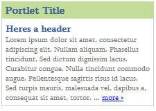
Here is a quick way to make nice little css boxes that look like portlets.

This first one is the simplest as it just has a background-color for the top bar, and a 1 pixel border. Look out for Portlets in CSS (2) which uses a customized background image.

Here is the simple html - it is just 2 divs (Note this particular example is contained in another div with a width of 220px)

<div class="portletTitle">Portlet Title</div>
<div class="portletContent">
<span class="header">Heres a header</span><br>
Latin Text... <a href="#">more »</a>
</div>
</div>

Here is the css
.portletTitle {
background-color:#c3dc9a;
line-height:15px;
font-weight:bold;
color:#395F97;
padding:5px;
}

.portletContent {
color:#6c6d71;
border-left:1px solid #cccccc;
border-right:1px solid #cccccc;
border-bottom:1px solid #cccccc;
padding:5px;
background-color:#ffffff;
font-size:11px;
}

Monday, February 23, 2009

How to Customize lists using css


So the unordered list - ul, by default gives us the standard bullet. This can be easily switched out and replaced by any image you design in photoshop/illustrator.
Applying some styles to the font can really make your list stand out.

Heres an example:
All you do in your html code is give the div an id, and make sure that each li element has the hyperlink reference
<div id="contentPanel">
<ul>
<li><a href="#">1 »</a></li>
<li><a href="#">2 »</a></li>
<li><a href="#">3 »</a></li>
</ul>
</div>

The css is where we take care of things - the lines of note here are bolded: These 2 lines are what is required to indicate you are not using the standard bullet and will be replacing it with a custom image.

.contentPanel {
background-color:#ffffff;
padding:10px;
}

.contentPanel ul {
list-style-type: none;
padding-left:0px;
margin-left:5px;
margin-top:0;
}

.contentPanel li{
background:url(../images/ul-dot.jpg) left no-repeat;
background-position:0 10px;
padding-left:15px;
padding-top:5px;
}

.contentPanel li a{
text-decoration:none;
color:#395F97;
font-weight:bold;
}

.contentPanel li a:hover{
text-decoration:none;
}

The last 2 declarations just take care of the font for the links.

You can get creative for the image, for this one I just used a pencil in photoshop to draw an arrow-like shape.

How to Center Divs using css


Ok, for my first post I'll start of with something really easy that I used to always cheat and use a table for - centering a div with css. Its very straighforward.

Here is the css - the most important line here is the margin:auto line in the background style. See the attached screenshot for how this looks. I actually used this code for a site, so I left the white border in this example as it adds a nice effect.

body {
background-color:#373b44;
color:#650b0b;
margin-top:25px;
}
#background {
width: 800px;
height:520px;
margin: auto;
background-color: #c0c0c0;
border:3px solid #ffffff;
}

The html page just has the call to the class to achieve the effect
div id="background"